Last Updated on 3 months ago by Gila
Effective Landing Page Strategies For Email Capture: The 5-Part Formula for High Conversion
Introduction:
A landing page is a single, focused web page with one goal: to convince a visitor to take one specific action—in your case, to submit their email address.
This page is the gateway to your email list. While you might use a powerful tool (like those we discussed in our software guides), the tool can’t write the words or pick the right image. That’s your job.
This guide provides the simple, 5-Part Formula for creating Effective Landing Page Strategies For Email Capture that work for beginners, ensuring you maximize your sign-ups without complex technical knowledge.
TL;DR: Use a simple 5-part formula to design calm, focused landing pages that make it easy for visitors to join your email list.
- Decide on one clear promise and outcome for your lead magnet or freebie.
- Write a benefit-first headline and short, reassuring copy focused on what subscribers gain.
- Add trust signals like testimonials, credibility notes, or a short “who this is for” section.
- Keep the page clean: remove menus, extra links, and anything that distracts from the email form.
- Use a short, low-friction form (start with just an email field) and a clear, specific CTA button.
- Match the page to your traffic source, design mobile-first, and A/B test small changes over time.
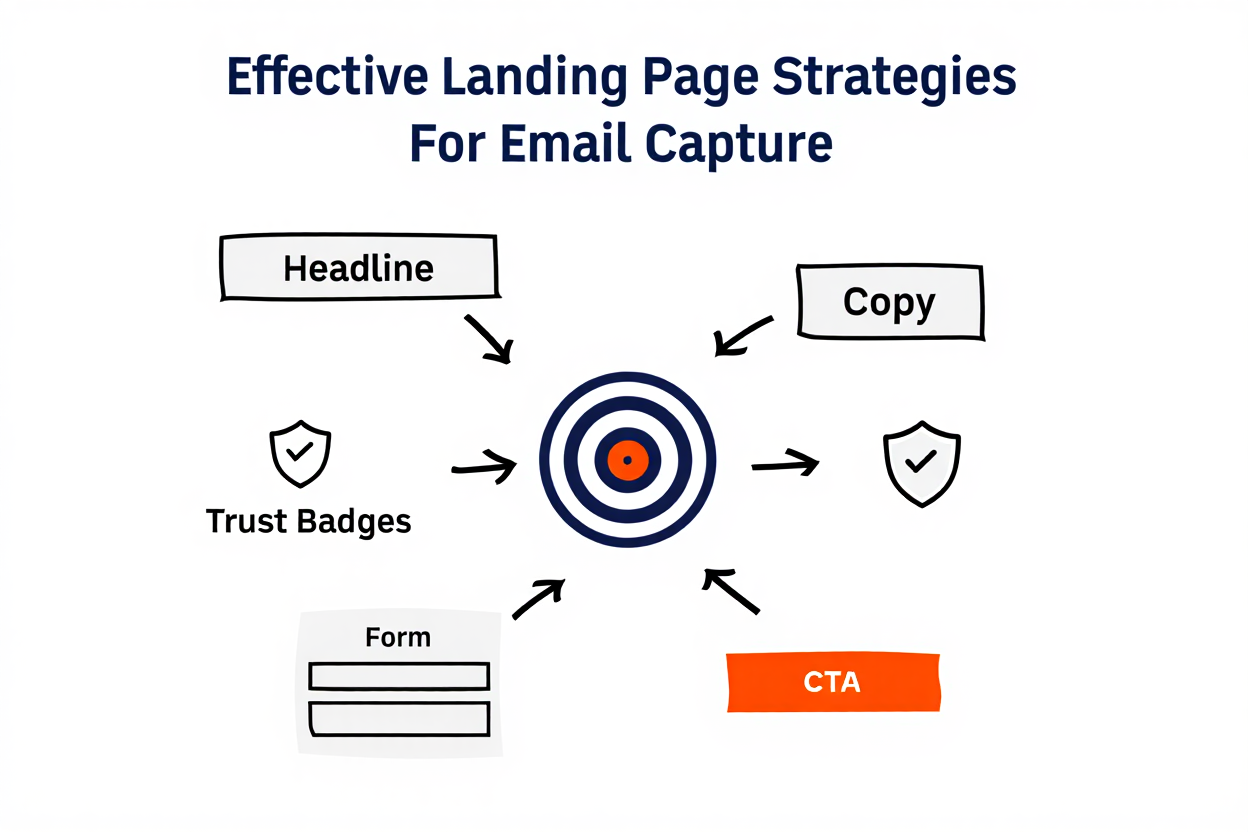
Part 1: Anatomy of a Landing Page (The Conversion Formula)
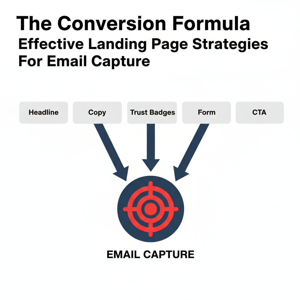
Landing pages follow strict rules because they are designed to eliminate distractions and drive a single action. Every successful page must have these five core components:
- The Clear Headline (The Value): Answers “What will I get?” instantly.
- The Concise Copy (The Why): Explains the benefits in short, easy-to-read points.
- The Trust Signals (The Proof): Shows the visitor you are credible.
- The Minimal Form (The Frictionless Step): Asks for only the bare minimum of information.
- The Strong CTA (The Action): The button that guides the conversion.
Want a calm foundation before you build landing pages?
Part 2: Strategy 1: Mastering the Copy (Headline & Value)
The words on your page are the most powerful tool for improving conversions.
1. The Headline: Promise a Specific Benefit
Your headline is the first (and often only) thing a visitor reads. It should speak directly to the customer’s pain point or desire.
- Bad Headline: “New Digital Marketing eBook is Here.”
- Good Headline: “Stop Guessing Your SEO Strategy: Download the 10-Point Checklist Today.” (This targets a pain point—”guessing”—and promises a specific solution—”checklist.”)
2. The Body Copy: Focus on Benefits, Not Features
Visitors don’t care what your product is; they care what it does for them. Use simple bullet points to highlight the gain.
- Features (What it is): “The software has a 99.9% uptime rate.”
- Benefits (What it does for you): “Never worry about downtime again, guaranteed.”
3. Trust Signals: Show, Don’t Just Tell
Trust is built visually and immediately. Use social proof to reduce the visitor’s doubt about giving you their email.
- Testimonials: Include a short quote from a happy customer: “This template saved me 4 hours immediately!”
- Trust Badges: Display logos of media mentions (“As Seen In”) or show a dynamic count: “Join 10,000+ happy subscribers.”
Part 3: Strategy 2: Optimizing the Design (Layout & Forms)
The design of a landing page acts like an arrow, pointing the user straight to the call-to-action (CTA).
1. Eliminate Distractions (The Technical How-To)
A landing page has one goal: conversion. Every extra link is a hole in your sales bucket. You must remove all elements that give the visitor a path to leave the form.
| Distraction Element | Why It Must Be Removed | How to Check (Technical Tip) |
| Header Navigation Bar | It encourages visitors to browse your homepage or “About Us,” delaying the signup. | Ensure your page builder’s “settings” explicitly disable the site header/menu. |
| Site Footer | Footer links often contain social media icons, privacy links, or contact info, which offer an exit path. | Only keep the link to the Privacy Policy/Terms and Conditions, and make it open in a new pop-up window. |
| External Hyperlinks | Any text that links out to another website or blog post. | Scan your copy and ensure no text is hyperlinked. The only functional link should be the CTA button. |
| Social Sharing Icons | Icons for Facebook, X/Twitter, etc., give the user a reason to leave your page and get distracted. | Do not allow visitors to share the landing page itself; they must convert first. |
2. Make the Form Simple and Frictionless
The form is where the transaction happens. Any unnecessary field lowers the conversion rate.
- Ask Only for Email: For a free offer (like a guide), ask for only the email address. Asking for a name, company, or phone number dramatically increases friction.
- Use Multi-Step Forms: If you must gather more data, use a Multi-Step Form. The first step asks only for the email (low friction), and the second step asks for the extra details (high data collection).
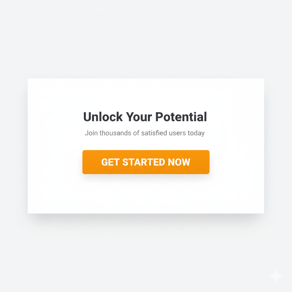
3. The Call-to-Action (CTA) Button
The button needs to be visually impossible to miss.
- Contrast is Key: Use a high-contrast color (e.g., a bright orange button on a white or dark blue background).
- Actionable Language: The button text must describe the benefit, not the action.
- Bad: Click Here
- Good: Get My Free Template
Ready to support your landing page with stronger email marketing?
Part 4: Foundational Best Practices (Testing and Alignment)
1. Match the Message (Source Alignment)
The headline on your landing page must perfectly match the message of the ad, social media post, or email link that sent the user there.
- Example: If your Facebook ad says, “Exclusive 20% Off for New Signups,” your landing page headline must immediately say, “Claim Your Exclusive 20% Off.” If the messages don’t align, the visitor will leave instantly.
2. Mobile-First Design (Design for Thumbs)
Since the majority of traffic now comes from smartphones, your page must be optimized for mobile devices first. Ensure the layout is a single, vertical column with large, easy-to-tap buttons.
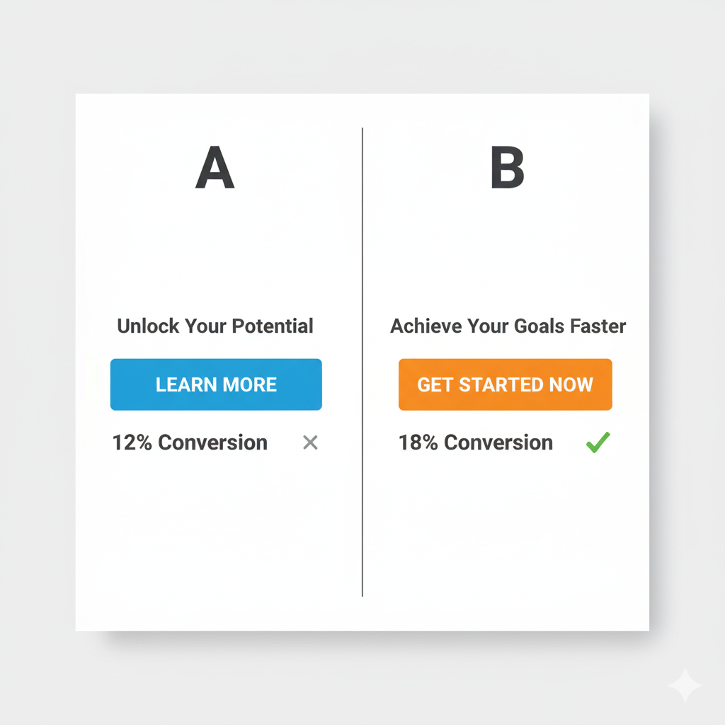
3. Always Be Testing (A/B Testing)
Never assume your first design is the best. Use the A/B testing features in your landing page tool (like MailerLite, Leadpages, or OptinMonster) to test one element at a time:
- Test Headline A vs. Headline B.
- Test Green Button vs. Orange Button.
Once your landing page is working, these guides help you grow traffic and income calmly:
Conclusion
Helpful External Resources for Landing Pages & Email Capture
Creating Effective Landing Page Strategies For Email Capture is all about psychology and simplicity. By eliminating distractions, focusing your copy on benefits, and keeping your forms as short as possible, you will maximize your conversion rates and build your email list faster than ever before.
Next Gentle Steps for Your Email List
If you’d like a calm, step-by-step path to connect this landing page work with the rest of your online business, you’re welcome to start with my free Affiliate Marketing Starter Kit for Beginners . It walks you through the key pieces: simple tools, basic SEO, content checklists, and a light weekly routine you can repeat.
When you’re ready for deeper training and community support, you can also explore the lessons and step-by-step website training at Wealthy Affiliate . Many retirees find that following a structured course, at their own pace, makes it easier to stay motivated and keep improving their landing pages, email funnels, and content over time.
Take the next step that feels manageable for you—one small improvement to your page, one tiny test, or one new email sent to your list. Steady, gentle progress really does add up.
Part 5: Frequently Asked Questions (FAQ)
Q: What is the single most important element to test on my landing page?
A: The Headline. Since up to 80% of visitors only read the headline, testing different versions (focusing on a specific benefit or solution) is the fastest way to improve your page’s conversion performance.
Q: Should my landing page have a menu bar?
A: No. The golden rule of landing page design is to remove all site navigation and external links. The visitor should have only two options: convert or leave. Any links to your homepage or “About Us” page will pull them away from the goal.
Q: How is a landing page different from my website’s homepage?
A: A homepage is a broad hub for general browsing and brand information. A landing page is a specialized conversion tool designed for a single goal (like collecting an email) and is used for campaign-specific traffic (like traffic from a paid ad or a social media post).
A: Multi-step forms reduce friction. By asking for only the email address on the first step (the key information), you get the conversion, and the user is psychologically more committed to completing the second step (which asks for extra details like company size or name).
Q: Why should I use a Multi-Step Form instead of a single, long form?